Figma's Interactive Components Were Not Designed For This


This week Figma launched their Interactive Components feature in beta. The response from the design community has been uh, surprising.
The feature was probably designed with problems like these in mind:
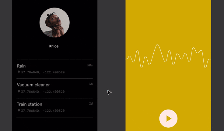
That hasn't stopped designers from filling my timeline with incredible, bizarre prototypes like this:
...and this:
...and even this:
Prototypes like these beg the question... why?
Or, more specifically, why make this in Figma?
Personally, I'm a big fan of making stuff with the wrong tools. Projects like Poom inspire me. A long time ago, I made a kind of Minecraft game in Framer.
Pushing constraints and building wild prototypes is fun, but Figma is a special case because its prototypes don't work like anything else. To learn more about why these new protoypes are exciting (or ridiculous, depending on your perspective) let's go back and look at how we got here.
Draw a Noodle
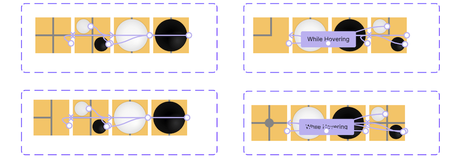
In 2017, Figma released its first set of prototyping features. It worked like this: select Frame A, draw an arrow to Frame B; and then in the preview mode, interact with Frame A to transition to Frame B.
While the team has continued adding to this part of the app, it hasn't changed much. Prototyping in Figma has always been about creating links between Frames.
In fall of 2020, Figma released Component Variants, a new feature that lets a designer create related snapshots of a Component.
Interactive Components brings prototyping to Component Variants, allowing a designer to create links between Variants.

It works pretty much the same way: select Variant A, draw an arrow to Variant B; and then in the preview mode, interact with Variant A to transition the Component to Variant B.
To learn why this change matters so much, let's first look at some of the problems with Figma's prototyping model.
Noodle Problems
Figma's prototyping model was always good for simple click-through prototypes but it struggled with anything complex. This is because, before Interactive Components, Figma's prototype only kept track of the user's current Frame.1

Clicking a link would change the current Frame.

And that was pretty much it. Building a prototype like this was easy to learn and easy to use. But it had two problems.
Problem 1: Lots of Noodles
Even a small prototype has lots of links, each of which would need to be created by hand.

There were some tricks to reduce the number of links, such as using the "Back" transition target or setting your links on a Component and then reusing that Component between Frames, but there was really no escaping it: prototyping in Figma meant drawing lots and lots of arrows.
And while I really like drawing arrows, needing to draw so many arrows made it extremely tedious to prototype even a medium-sized project in Figma.
Problem 2: Compound Noodles
There was a bigger problem, however.
Real apps keep track of lots of information that describes the current "state" of the app. Navigation is often only a small part of that state. An app's state might also hold information such as the current user's name, their preferences and settings, or the contents of their shopping cart.
By comparison, a Figma prototype's state included one piece of information: the user's current Frame.
This meant that a designer looking to model other types of state, such as whether the user is in a "light mode" or "dark mode", would have to somehow achieve this complexity with only that single property to work with.
The solution? Create a Frame for every possible state combination.

Once a designer had modeled each state as its own Frame, a user could "change the state" by linking to a version that showed the correct configuration.

As you can imagine, this doesn't mix well with the first problem.

Different kinds of state could make the problem even worse.
Adding a "dusk" mode would require yet another duplication, or three more Frames, which is bad enough. But adding a parallel state, such as "logged in", would mean duplicating the entire collection—so six more states on top of the original six, with even more arrows for each.

Given enough time and coffee, I could in theory prototype a working game of checkers in Figma using only links between Frames—but it would require about 500 quintillion Frames to do it, and an even greater number of links.
More realistically, once I'd built a medium-sized prototype with both light mode, dark mode, and an authentication state, I would never again change that design. Whatever I'd wired up would ship, sorry.
Enter Interactive Components
Giving each Component its own state means freeing that "current Frame" state from its extra duties, greatly reducing the number of Frames needed to model states other than the user's actual navigation.
While @mingyaaa's game of Go would previously have required 10172 Frames (a number far greater than the number of atoms in the universe), Ming-ya could do it with just four Components, each with four Variants and a simple set of links.
The fundamental problem hasn't changed: modeling a Component with multiple properties still means creating different Variants for each combination of the Component's properties. However, by pushing the problem down into Components, Interactive Components greatly reduces the number of combinations.
Prototypes that were impossible (or impractical) before are now comparitively easy to put together. That's good for everyone.
Prototyping Anything?
While Figma's Interactive Components do expand the field of what a designer can do in a Figma prototype, there are still some major limitations. Without the ability to store, refer to, or manipulate actual data like text, numbers, or values, designers will be limited to what can be fully represented through snapshots.
For example, Design XStream's text input has a "Single Letter" Component with Variants for each possible character. The input field is a row of 26 of these components. Pressing a key changes the Component's Variant to match the key that you've pressed.
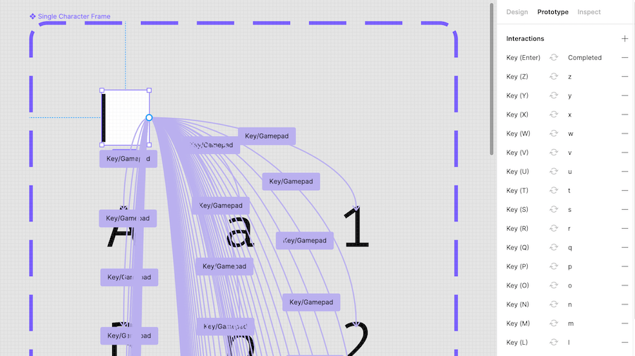
In other words, Figma isn't actually storing the text you type; it's just changing the Variant of each of those Components. There's no way to use that data outside of the component.
Fun with Prototypes
Ok, so prototyping in Figma isn't perfect. But as these prototype show, you can do a lot with Interactive Components. While I'll still use other tools for more serious prototyping, Figma's limitations do make for some excellent creative constraints.
Interactive Components might not have been meant to make text inputs or games, but when you give talented people simple tools to use, they can make some pretty amazing things. And I am sure that the feature was made to be fun—and in that sense, mission accomplished!
1 Technically speaking, Figma also keeps track of the user's visited Frames. This "navigation stack" works like a stack of cards: clicking a link would add a new Frame to the stack, and going back would remove the current Frame from the stack. Whichever way you went, the Frame on top of the stack would always become the new current Frame.